Last week, we talked about why you want to avoid Giant Walls of Text, and I showed you my sell sheet redesign through three different iterations. This week, I enlisted the help of our resident Graphic Design Guru, Christina Major, to give my sheet a proper makeover.
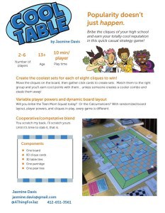
| As a brief reminder, here’s where I started:
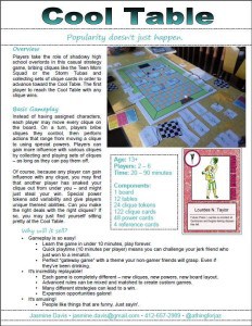
| In one hour, here’s what she did:
|
Here’s Christina to explain what she changed and why:
1. POPPING OUT THE ESSENTIALS.
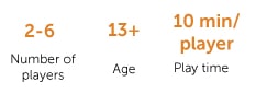
- Player count, play time, and age. These are kind of your “gateway” items that will let a publisher know if it fits with their needs right off the bat. On the last iteration of the sell sheet, they were hard to find because they were overlaid on the image and at the bottom. I found a nice place to put them at the top, but a callout box treatment might have worked too, depending on the layout.
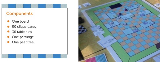
- Component list. This is a very practical concern for publishers to know how much effort it’s going to take to manufacture your game. It was left out of the last iteration, so I worked it back in.
- Gameplay photo. You don’t always want to show every piece in the game sitting unboxed on a table (unless the point of the game is that it comes with a lot of components). Instead, set up a situation where you can guess what the key mechanic is from the picture. In the case of Cool Table, a set of matching cards on top of the board next to a player piece with a small pile of Munchitos might be a good way to do this.
2. KEEPING IN MIND HOW IT’S GOING TO BE USED.
- No bleed. I prefer to design without images, backgrounds, or borders that go all the way when I’m designing a sell sheet for publishers. It’s much easier for me or the publisher to print them and it gives publishers space to write in the margins.
- Skimmability is important. If this sell sheet is accompanying a pitch at a convention, the publisher is probably getting several other business cards/pieces of paper at that show. Make yours easy to review I worked the key “what makes this game unique/why will it sell” mechanics into the headlines. Bullets, numbers, icons, and strategic color/bolding also help break up information.
3. CLEANING UP THE TYPE.
- The fonts looked a little boring. A good rule of thumb that’ll look good on your basic sell sheet is “sans-serif font text, slightly fancier sans-serif font headlines”. FontSquirrel is a nice site to get free fonts for personal and commercial use. I also recommend My FontBook, which is a handy web-based app that will let you see all the fonts on your system at a glance.
- Never use justified text (unless you don’t want it to be read). Having the ragged right edge helps give the space and variation people need to process words.
- Reduce the excess flavor text. While the flavor text does help convey the casual mechanics and humorous theme of Cool Table, we’re tight on space here. Find the key terms that embody the theme, and a good flavor image (I cropped into the card illustrations) to help get the message across.
You don’t have to be a graphic designer to make a super-awesome sell sheet*. Just read up, take these protips, and tear down that wall (of text)!
(* Though if you do need a graphic designer, you should let Christina know.)