I don’t claim to be an expert in graphic design. Far from it – learning Inkscape two summers ago took a lot of blood, sweat, and time. And of course I could still only do the basics.
But throughout my time in Game Design Land, I’ve been exposed to lots and lots of graphic design, particularly of the sell sheet variety. Sell sheets and other marketing paraphernalia have always been extremely interesting to me. They need to be both eye-catching and explanatory, while also piquing the interest of somebody who looks at dozens of these a day. They function as a sort of resume for your game, explaining why it’s cool, why it will sell, and what it’s all about…in as few words as possible.
THAT’S BECAUSE, IF IT LOOKS LIKE A CHORE TO READ, A PUBLISHER PROBABLY WON’T READ IT.
Instead, it’s about combining images, graphics, words, and all those other “designery” things into a cohesive whole. And it’s also about cutting way, way back on your text.
As somebody who’s made a bajillion mistakes, I want to lay it all out there and show you where a sell sheet of mine started and where it is today. It’s a little cringe-inducing, so bear with me here.
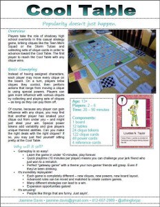
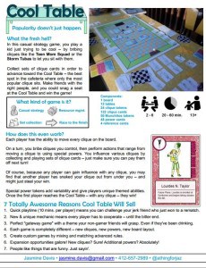
VERSION 1
I think I might have made this first version in PowerPoint – but that’s not what makes it terrible. See that huge column of text? Nobody, not even me, is ever going to read through that again.
Good bits:
Nice header and subheaders that clearly set off various bits of text
The information is all technically accurate
Bits to change:
So much text!
Doesn’t stand out in any way
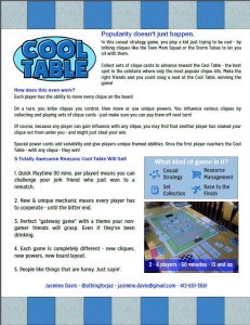
VERSION 2
Good bits:
Even bolder headers help set text off.
More personality in the text itself
More graphically interesting
Bits to change:
Somehow, it’s even more of a wall of text now
It doesn’t feel unified
VERSION 3
I created this one myself after taking into account feedback from people at the Card & Board Game Designers Guild on Facebook. It does stand out a little more, but it’s still pretty text-heavy (even though it’s more readable, text still stands out as the main element).
Good bits:
Everything matches and feels more unified now
Text has been cut down a bit and offers better readability
Bits to change:
You tell us! What changes would you make? What advice do you have to offer? Leave your thoughts in the comments, and next week, we’ll show you the results of a makeover by Christina Major, our very own graphic designer, along with her advice for revamping sell sheets.