Having a good sell sheet can be a key part of getting your game picked up by a publisher.
Sell sheets are useful for a variety of different situations: They look good online and in physical form so they can be used for any of the following: they can be emailed or posted on social media sites, they can be sent via conventional mail, they can be placed beside your game during a demo, and they’re nice to hand directly to publishers. A good sell sheet communicates the core of what your game is and gives publishers an idea of the potential for your game.
WHAT IS A SELL SHEET?
A sell sheet is a one-page document that is given to a publisher that includes exactly the right amount and kind of information a publisher needs to know, to determine if they should take a closer look at a game; no more, and no less.
Below are previous posts on the League of Gamemakers focusing on sell sheets. If you have not yet read these pieces, they are highly recommended:
- HOW TO BUILD A SELL SHEET FOR YOUR GAME
- GIANT WALLS OF TEXT & OTHER SELL SHEET MISTAKES: A SELL SHEET MAKEOVER
- GRAPHIC DESIGN TIPS FOR SELL SHEETS: A SELL SHEET MAKEOVER PART 2
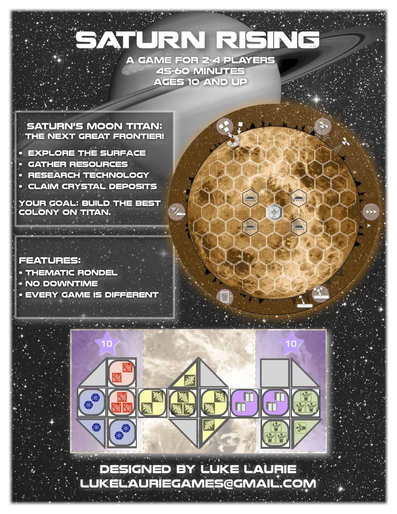
EXAMPLES OF SELL SHEETS
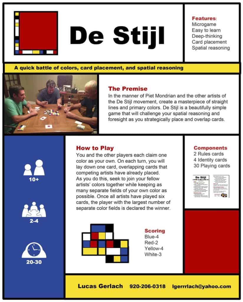
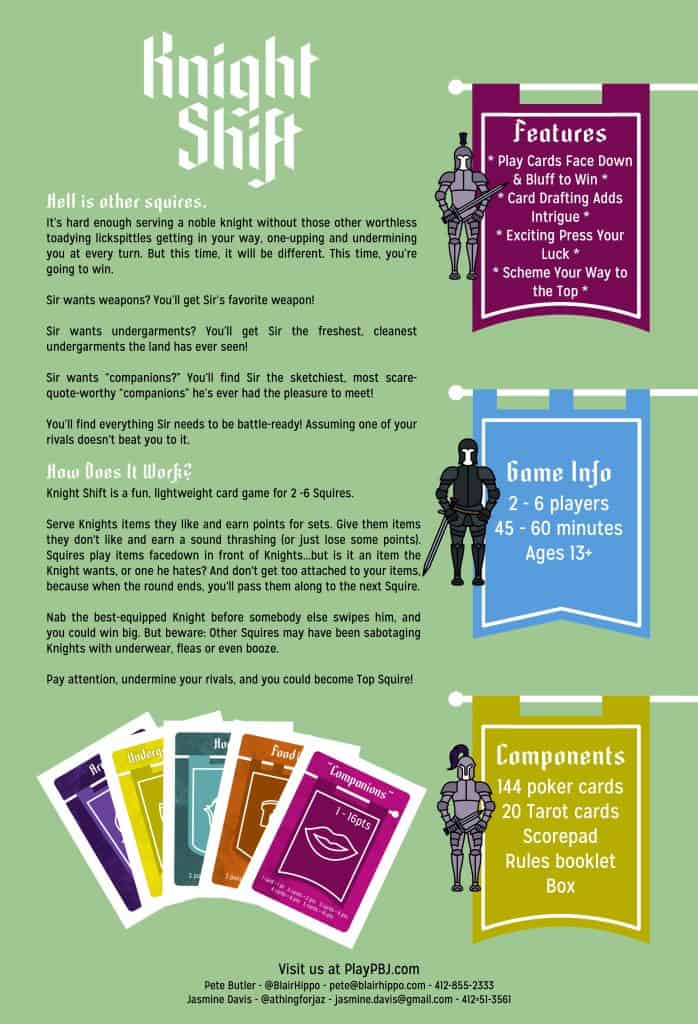
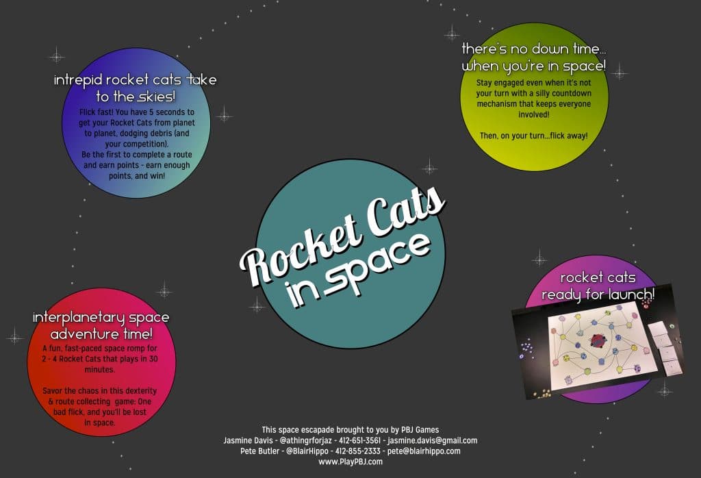
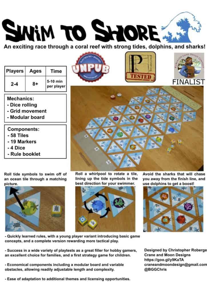
The sell sheets below are examples for you to look at and learn from. They were submitted voluntarily by their creators, and were not selected by any kind of criteria. You can see strengths and weaknesses in different approaches while you build your own sell sheets. Some of the documents had their file sizes reduced, so some images may not be high quality. Feel free to comment with your thoughts about what makes a good sell sheet in the comments section below.