I love graphic design. It’s my favorite part of this whole gamemaking process. I even did it professionally for a while. I like seeing the results of many hours of tweaking and playing with a design to get it just right:
But what about people who are not graphic design nerds like me? What does a game designer have to worry about when it comes to graphic design? How much is necessary and how much is too much?
It is commonly said in this industry that graphic design is the job of the publisher. And this is generally true. But can a designer benefit from good graphic design? I want to explore graphic design from a game designer’s perspective.
PURPOSE
What is the purpose of graphic design for a game designer? I would say there are two purposes for your graphic design as a game designer:
- Enable play testing
- Attract a publisher
ENABLE PLAY TESTING
Think of what kinds of feedback you want to get out of playtesting. Is your design hindering or helping this? Do your cards look so confusing or are they so hard to read that your playtesters cannot focus on that particular mechanic you were hoping to get feedback on? The key here is to enable your playtesters so that they give the feedback you are looking for. Last year at Gen Con we found and signed a game called Ascendant from Accidental Cyclops. Their first protoype (the one they showed us at Gen Con) looked like this:
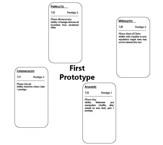
Everything you need to know to play the game is right there on the card. It is playable as it is. But, is it going to enable your play testing in the way that you want? You are going to be looking for certain things during play tests. You may want to know if a particular mechanic works. You want to know that the resources in the game are balanced. How can your graphic design enable this? There are a number of ways your design can help with your play testing. I will talk about a few of them here but I would love to here your comments as well. What graphic design tips do you have to help with play testing?
- TEXT
Small text can frustrate players and force focusing on reading the cards instead of playing the game. You want your text to be large enough for your play testers to see it and easily comprehend it.
- ICONS
In the same manner as above, large blocks of text can also distract from the game. You can break up text with use of icons to indicate various things in your game. Christina Major wrote a great article on using icons in game design. Some common uses for icons are victory points, resources, and actions.
![]()
- PLACEMENT
Be aware of where things are placed on cards (and boards, mats, etc). Use the entire card area and always make sure that if something is the same on multiple cards it is found in the same place on all cards. For example, if you have cards that give money when discarded you will need an icon/symbol to indicate how much for each card. This icon should be in the same place on every card no matter what else is on the card.
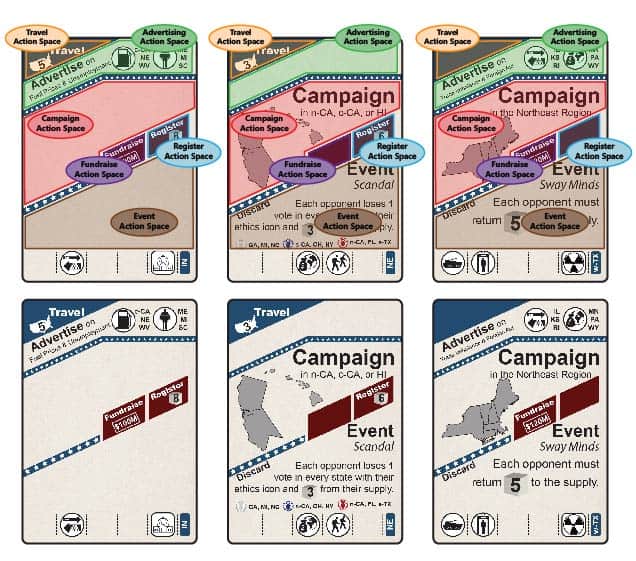
A good example of placement is our upcoming game Campaign Trail. Each card in Campaign Trail can be used for 4 actions (out of a possible 6). We created cards that have spaces for all 6 actions even though they are not all used on every card. That way play testers can easily look at a card and see that yes, there is something in that action space so it can be used for that action or no, that action space is blank so this card cannot be used for that action.
- COLOR
Color can be a major benefit to your play testers. Using various colors to delineate different areas on the card or different card types can clear up confusion and preemptively answer many questions.
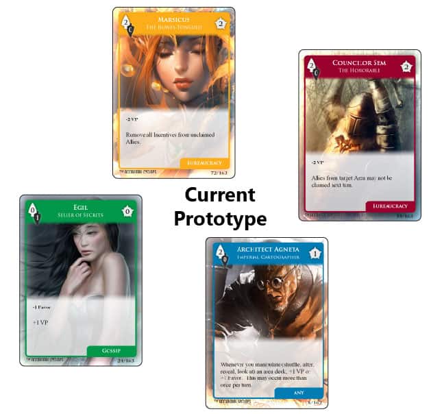
Let’s go back to Ascendant now. You saw their first prototype. One of the first things I asked the team at Accidental Cyclops to do was to revamp the graphic design. And they did a fantastic job! Their new design (shown below) shows the principles we just described. They used icons for resources and victory points. They used good placement techniques in showing which phase each card is played in. And finally, they used color to distinguish the various types of cards.
ATTRACT A PUBLISHER
If you will be shopping your game around, you will need to attract a publisher. Publishers aren’t looking for finished graphic design. They will do that themselves but when they have multiple choices of games to sign on, they will probably pick the prettiest.
What can you do to attract publishers and get your game noticed? Well, first of all follow the advice above. With good, readable text, iconography, consistent placement and good use of color you are already most of the way there. The rest is just making sure it looks professional. Having cards, boards, tokens, etc printed through a print on demand service such as The Gamecrafter or Drive Thru Cards really goes a long way in making your prototype look good for publishers.
THE BOTTOM LINE IS IF YOU CONCENTRATE ON TEXT, ICONS, PLACEMENT, AND COLOR, YOU SHOULD HAVE A GREAT PROTOTYPE THAT WILL ENABLE PLAY TESTING AND ATTRACT PUBLISHERS.
I hope this has given you a bit of an overview on what you should be thinking about when it comes to graphic design from the perspective of a game designer. What other graphic design tips do you have? Please write them up in the comments and we’ll share them on our twitter and/or Facebook pages. Happy designing!