Whether you’re putting together a prototype or Kickstarting your own game and making all the cards yourself, typography is a key detail that can convey or betray your professionalism (or lack thereof).
WHO CARES WHAT YOUR TYPE LOOKS LIKE?
Nobody at your table, ideally. While the other elements of your art and components might be designed to be impressive and eye-catching, what you want out of typography is an invisible experience. Great typography in a game doesn’t mean fancy illustrative fonts, most of the time. It means that type treatment is so intuitive and serves the game so well in both theme and mechanics (just like your iconography, right?) that nobody has trouble reading or understanding your design choices to even think about whether they like or hate it.
So how do you master this invisible art? It starts with the right font.
PICK A FONT, ANY FONT!
Now, you can use the fonts that are on your computer for your game, just like you can use generic clipart for your illustrations, and I’m not going to tell you that never works. But you can also find a lot of free or low-cost fonts online, and they will give your game a fresher look and make it feel more unique.
I usually start with Font Squirrel or Google Fonts, both because they’re free for commercial use. Commercial projects are things you’re making money off of, so you want to make sure any font you acquire is licensed for that if you’re publishing. If it’s just a prototype, though, non-commercial is fine.
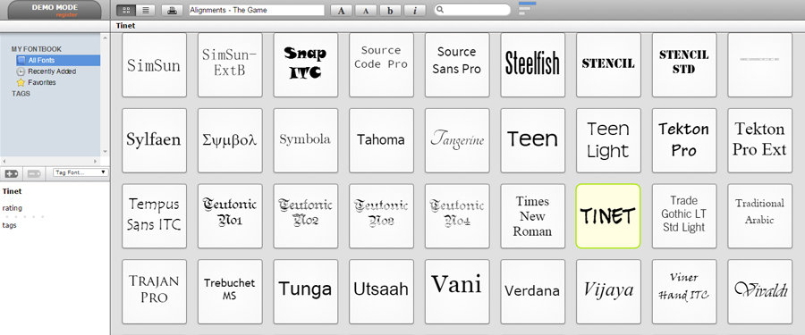
You’ll probably actually want two or three fonts, so try to find things that look like they belong together. If you’ve installed a bunch of fonts and want a quick way to browse/try them? Check out Font Viewer, a web-based app that builds a nice visual catalog of the fonts on your computer on the fly.
ASSIGNING HIERARCHY
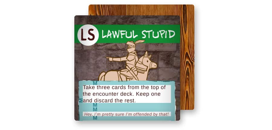
Picking a family of fonts that go well together is really only half the battle. For game components like tiles or cards, you can break your font treatments down in a hierarchy. Typography is a relative thing. Think about the information you’re conveying and the speed of accessibility to determine emphasis.
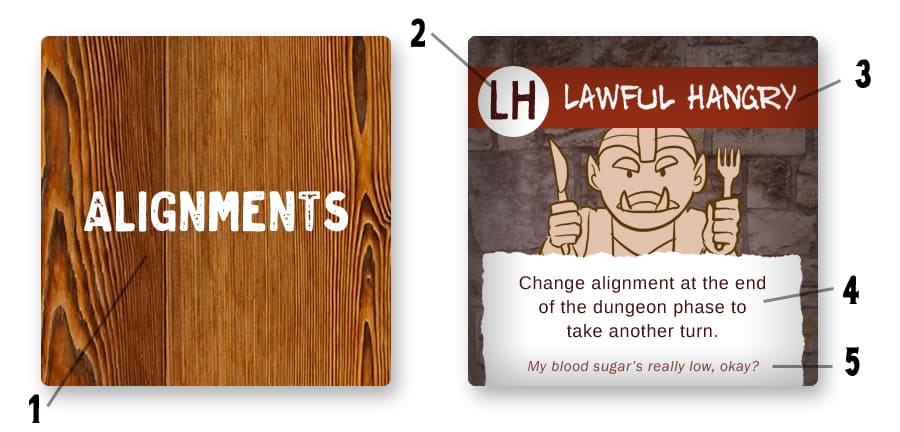
- 1. Illustrative/Logo Treatment: Logo treatments reinforce the flavor and style of your game more than anything else, but you might also have a word game or labels on the back of different decks where the typography will be your art. Like any illustration, an experienced artist will often be essential in giving it the right look for your finished game. But if you’re just prototyping, big and clear will do just fine.
- 2. Functional: Think of the numbers or letters in the corner of an Uno deck or the tiles in Acquire. They’re not really there to be read so much, just glanced at to identify what group/row/column it belongs in, so they need to be your quickest read. Make Functional type your highest emphasis by making them larger than the other fonts, in a bolder font face, or with the highest amount of contrast with your backgrounds.
- 3. Header: A header treatment’s going to be used in name of a card or tile. This might be a thing you reference, like a cheat sheet outlining player phases. So they also need to be big and clean, but a touch smaller and with less emphasis than your Functional treatments. You can use a slightly more thematic font if reading this text the card/tile isn’t essential once it’s played.
- 4. Descriptive Descriptive text, if you have it, outlines the function of the component, and comes up a lot in deck-builders and other card based games. This should be your very simplest, most basic looking font. Do not try to get cute with thematic/narrow/bold/italic fonts here.
- 5. Flavor: If you want to educate your player beyond the basic function of the card/tile about the history of the Norse Gods or national parks, make this a point size smaller than the Descriptive treatment/a shade lighter/italicized to indicate it’s optional information that won’t affect the gameplay.
TREAT YOUR TYPE RIGHT
Let it breathe: Leave at least 1em (the width of the letter M in your font) of space around the edges of the card. These are easy fixes in Photoshop/Illustrator/InDesign. If you’re trying to prototype using tables in a word processing program, you can also change your cell padding in Microsoft Word. And if you’re working with a printer, ask them how much space they prefer you leave. Sometimes they’ll have guidelines for bleed and safe area.
Don’t use light text on dark backgrounds for anything longer than 5 words. For headers, it may work out, but if you have a longer description on a card, you want it to be dark text on a light-colored background with lots of color contrast to be easier to read (and also to print).
Visually balance your type for a natural read. Try not to leave one word of text on its own line in a paragraph; you can either put a hard return or play with letter spacing/kerning here. Also, I’m usually of the school that says any technique can work in the right context, but for the love of all that is holy, never use any tool in an art or word processing program that auto-justifies your text. It will bloat out your spacing and look bad every time.
Instead, look to adjust the space between your lines (leading) and letters (kerning) to make the typography easy to read.
CONCLUSION
Though your art and minis might be the starring actors on the stage of your board game, typography is part of the backstage crew that invisibly frames the experience. By having even just a bit of knowledge behind the art of typography, you can showcase your game in the best light possible, whether that’s presenting it to your publisher or getting your Kickstarter funded. Happy fonting!