Branding is important for every company, no matter what you’re selling. But it gets especially tricky when you’re self-publishing your games and reaching out to potential customers with your brand. Look professional, yet casual. Serious, yet fun. Make every game look unique and exciting, yet still tied into your brand.
Brand guidelines are power tools graphic designers use when we’re creating a brand. Think of them like rules that you’re going to hold yourself to when presenting your company. Your games might explore any theme from insects to castle building, but a well-executed brand can tie them together as family friendly, sophisticated, casual or geek-focused across your Facebook, Kickstarter, sell sheets, and package design.
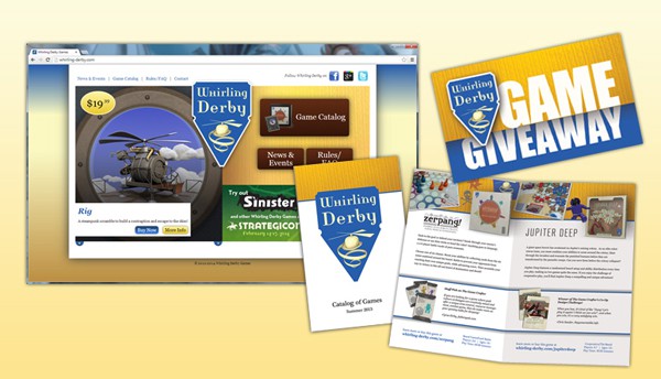
Big companies get very detailed about brand guidelines, but even a small document where you keep a few particular pieces of information is a great start. Here are some simple guidelines for our game publishing label, Whirling Derby.
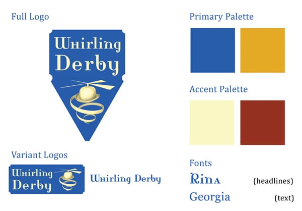
Logo – The full Whirling Derby logo is used whenever possible, but on instruction sheets or box panels, space can get very tight. Design yourself some variant logos that work in vertical treatments, horizontal treatments, and on dark or light backgrounds, and you’ll be prepared for any situation.
Colors – These are the colors we want to use most often to give at-a-glance recognizability to our games. In my experience, it’s best to work in pairs for colors; the blue or yellow alone doesn’t carry the same whimsical feel as the two colors together. Limiting your color pallet to select colors will help your pieces look consistent, even when they have very different designs.
Fonts – The fonts we chose were a bit quirky, yet classic. Again, it’s best to work in pairs for fonts. You won’t find any one font that will work for both your website and your instruction book, so find a few interesting fonts that are readable large and simple fonts that work small. fontsquirrel.com is a great place to find some unique fonts that are free for commercial use in your games.
What game branding have you noticed from your favorite publishers? Have you created a brand for your own games? Let us know in the comments!