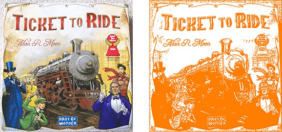
WOULD YOU HAVE BOUGHT OR EVEN TRIED THESE GAMES IF THEY WERE ALL ORANGE?
Maybe not. Maybe the art would have turned you off, but just think of the gaming experiences you would have missed out on.
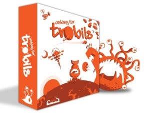 When we launched Asking for Trobils a few days ago, the first questions we got were why we decided to make everything orange. On the page I simply say we like orange, and we do, but of course, there’s a better answer than that.
Most designers can’t remember how an entire game got started in their head. When we started designing Evil Intent, it came about through several conversations. There’s no real moment that I can concretely say, “that’s when it started”. Asking for Trobils was different.
I WONDER IF IT WOULD BE POSSIBLE TO DESIGN A BOARD GAME USING ONLY ONE COLOR.
That was a random thought that popped into my head one day when I saw the two colors of white and orange flash on a tv screen. They were just words for some commercial I don’t recall. I doubt I could tell you what that commercial was even then. i wasn’t really paying attention to the television, I just happened to look up.
I had also recently been enthusiastic about the game Tokaido that used a lot of white in its design. I appreciated the simplicity of the art and wondered if I could even make it more simpler. One color.
You can’t base a game design off of just one idea about color though. After I had realized I said it out loud, Erin (co-designer of both Evil Intent and Asking for Trobils) asked, “Okay, but what would the theme be?”.
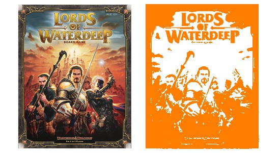
I knew right away… “space”. I had recently been complaining that a space game I had just bought, while a good game to play, looked just like all other space games. In fact, every space game on my or my friend’s shelves looked the same. If you put them all together on a shelf and removed the logos, you might have a hard time grabbing the right one. They all had that photoshoped black space with nebula and 3D ships look. Don’t get me wrong, I like the look, but none of them were different from the other as far as art really went.
SO WHEN ERIN ASKED ME WHAT THEME WOULD GO BEST WITH THE RIDICULOUS THOUGHT OF A ONE COLORED GAME, IT WAS SPACE.
Orange was, not only my favorite color, but pretty much the polar opposite of any color you would think to use on a space game. Obviously using one color meant simplistic drawings. This made the wacky feel and look come together quite naturally. Erin had a few things she had been wanting to work on as well. A worker-placement was on top of the list. It was important to us that, even though the game looked simplistic, that the game play was strong and re-playable. Everything fell into place. Within 8 hours I had sketched on index cards and notebook pages the entire game (minus art) and we test played it right there.
Months went by and new mechanics were added and updated. There’s some stuff in there that hasn’t been used in other games like it. We’re really proud of what we made. We’re still playing it just for fun even though the test period is over, and considering how much we play tested it, that’s saying something.
DID WE EVER QUESTION ALONG THE WAY IF WE SHOULD CHANGE THE COLOR OR ADD MORE COLORS?
Of course, but I stayed true to my original art design because I truly wanted to see how people reacted to having the space theme spun around on its heels.
Now that the game has been on Kickstarter, we’re getting people saying things like “Why is it so orange?” and “Way too tough on the eyes!”. We know that through the video it may be a little bright and hard on the eyes, but I think in this case it’s a problem with the medium not portraying the product well. If you look at the image below, you can see that in a real life experience, the game isn’t that overwhelming with the normal colors of life around it. We haven’t had any complaints from play testers.
The problem is, things outside the norm scare people when purchasing. If I see three blenders that all look the same and a fourth that looks completely different at the same price, I’m either going to be very interested in it, or repelled by it. What does it say about a Backer who sees a totally different look and feel for a game and jumps in verus the Backer who is cautious?
Watch the review (there will be more) by Undead Viking, ask us questions, read the rules. We promise, if you decide to give a completely weird design a chance, you may just be proud to have this beaming orange box on your shelf.